Color is one of the most powerful tools in branding. It shapes perceptions, triggers emotions, and influences consumer behavior. The colors you choose for your brand tell a story—whether you realize it or not. So, what does your color palette say about you?
The Meaning Behind Colors in Branding

Red: Passion, Energy, and Urgency
Brands like Coca-Cola, Netflix, and Target use red to evoke excitement and urgency. It’s bold, powerful, and often linked to action, making it a strong choice for brands that want to create a sense of enthusiasm and movement.

Blue: Trust, Stability, and Professionalism
Used by brands like Facebook, IBM, and PayPal, blue conveys security, reliability, and calmness. It’s a go-to for tech, finance, medical and corporate industries because it instills trust in consumers.

Yellow: Optimism, Creativity, and Happiness
Yellow is associated with warmth, positivity, and friendliness. Companies like McDonald’s, Ikea, and Snapchat use it to grab attention and radiate an approachable, fun energy.

Green: Growth, Health, and Sustainability
Brands like Whole Foods, Starbucks, and Animal Planet use green to communicate environmental consciousness, wellness, and renewal. It’s perfect for brands that want to highlight nature, health, or financial growth.

Black: Luxury, Sophistication, and Power
Black is sleek, authoritative, and timeless. Brands like Chanel, Nike, and Apple use black to convey exclusivity, modernity, and sophistication.

Purple: Creativity, Royalty, and Imagination
Purple is often linked to luxury and originality. Companies like Cadbury, Hallmark, and Twitch use it to evoke a sense of innovation, mystery, and elegance.

Orange: Playfulness, Energy, and Affordability
Orange is vibrant and energetic, commonly used by brands like Fanta, Harley-Davidson, and Amazon to create a fun, confident, and accessible brand identity.

How to Choose the Right Color for Your Brand
1. Define Your Brand Personality
Ask yourself: What emotions do I want to evoke? A luxury brand may lean towards black and gold, while a health brand may choose green and white.
2. Consider Your Target Audiences
Different colors appeal to different demographics. Blue is often preferred by professional audiences, while bold colors like red or orange may resonate more with younger consumers.
3. Look at Industry Standards—But Stand Out
While tech companies often use blue for trust and stability, some (like Snapchat with yellow) break the mold to differentiate themselves.
4. Use a Balanced Palette
Most brands don’t rely on just one color. A primary color should dominate, while secondary and accent colors complement the brand’s overall identity.
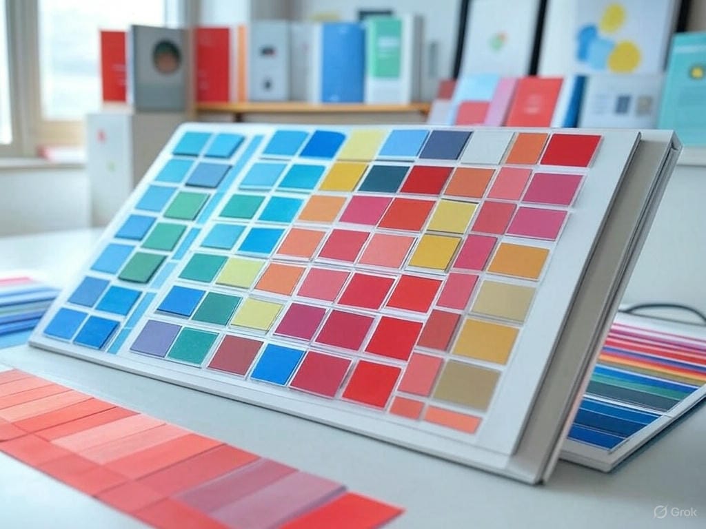
Final Thought: Color is a Strategy, Not Just an Aesthetic Choice
Your brand’s color palette should be intentional, reflecting your values, industry, and audience. Whether you choose bold reds, calming blues, or luxurious blacks, make sure your colors align with the story you want to tell.
The right color choices can create lasting impressions—so choose wisely.


